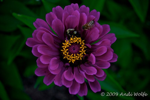
I'm processing these photos on the dark side intentionally for effect. This and the last batch from my previous posting have high color saturation and deep contrast. I like the sensuality this gives to the images, but I'm interested in feedback. You can leave a comment here or on my Flickr page. Thanks!
Thursday, September 03, 2009
Subscribe to:
Post Comments (Atom)


3 comments:
I think this looks great on the dark background. I looked on Flickr, and with the white background, I think it would look better if it was a bit brighter.
Out of curiosity, did you expand the photos on Flickr? I think the thumbnails definitely look too dark, but I thought the larger photos were ok. Let me know what you think. Thanks.
i and my old laptop see nothing but perfection!
thaks
Post a Comment